Big Wheelbarrow — KPI Dashboard
Fall 2022 Industry Project

Introduction
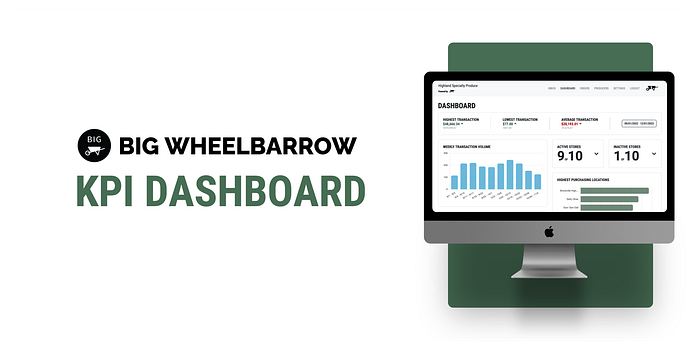
This quarter, our team had the privilege of working with Big Wheelbarrow, a company that develops supply chain software for local producers and grocers. Their cloud platform provides clients with a unified view of inventory, orders, and deliveries. Their database contains an abundance of real-time data, but users currently cannot view this information in a helpful manner. Thus, our goal was to build a Ruby on Rails and PostgreSQL KPI dashboard that integrates with their existing web application and displays valuable transactional data for store managers using several different charts and performance indicators!
The Team

George Berdovskiy — Project Manager
Hannah Aldor — Developer
Satyam Goyal — Developer
Robert Au — Developer
Matthew Fulde — Developer
Jaskinder Sarai — Developer
Sriram Magesh — Designer
Judy Yang — Designer
Matthew Park — Designer
Timeframe
October through November 2022 | 6 weeks
Tools
Our design team used Figma extensively, while our development team used Ruby on Rails, PostgreSQL, Stimulus, and Chartkick.
The Project


Design
Problem Statement
How might we present Big Wheelbarrow’s abundant real-time data to deliver essential business information to customers in an informative and impactful manner?
Research

Our design team conducted research during the first two weeks of the project. After familiarizing ourselves with the mockup that the Big Wheelbarrow team provided us, we set up informational meetings with them for more detail and clarification. Since we weren’t able to connect directly with their clients for user research and interviews, the insight provided by Christina and Kat during these meetings was monumental to understanding our users.
We conducted several literature reviews of other KPI dashboard case studies in order to understand what worked and what didn’t since this was the first time any of us had designed a dashboard. We also learned relevant terminology in the category management industry (such as gross transaction volume) to further empathize with the user.
Ideation

In order to synthesize our research, we made an affinity map to identify the main user needs and pain points we would need to address moving forward. We also developed a user persona based on the information the Big Wheelbarrow team gave us and used this to create our initial sketches.
Design System

After iterating through several versions of our mid-fidelity concepts, we decided to implement color in our designs. While working on our wireframes, we initially used the colors provided by Big Wheelbarrow — olive green, dark red, black, and white. We understood that the emphasis was not on creating a new design system but rather complimenting their already existing system. Thus, we decided to add secondary colors that were more vibrant. The secondary colors observed were actually sampled from Big Wheelbarrow’s demo product. Similarly, we used the typeface specified and created components that followed Big Wheelbarrow’s brand guidelines.
User Testing
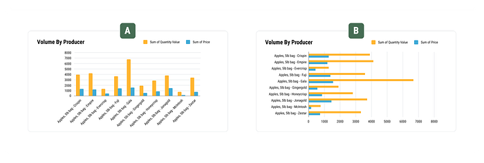
Due to our project’s nature, we could not user test with the general or target audience we were designing for. Thus, we worked internally within both our CodeLab and Big Wheelbarrow teams to receive feedback on our designs. The main focus of our usability testing was to better understand which charts people preferred and why. We again met with the Big Wheelbarrow team to review each chart’s importance and what they were trying to prioritize. Afterward, we re-defined our graphs and came up with different variations. We then conducted several rounds of A/B testing and performed literature reviews.

High Fidelity and Responsive Design
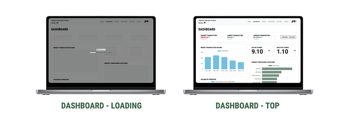
With the feedback we collected (in addition to our own iterations), we finally created our high-fidelity KPI dashboard. Our primary concern was to show the most information possible on the static screen of a device. Thus, we worked on balancing secondary features (such as lists of active and inactive stores) using drop-down menus. We created a dashboard with a clear visual hierarchy, prioritizing the graphs that the clients would find most important and placing the most significant numbers at the top. We wanted to reduce the cognitive load yet still properly accentuate each graph.
Lastly, we worked on creating responsive designs so that Big Wheelbarrow clients could access their dashboards whenever and wherever they wanted.

After finalizing our designs, we worked with the developers to explain our high-fidelity screens and design decisions so that the hand-off process between our teams would be smooth.
Development
Timeline
During weeks one and two, our development team learned more about the tools and languages used by Big Wheelbarrow and installed all the required tools and dependencies. Once we had finished the setup of our development environments, we began to explore the database schemas and experiment with different queries (week three). We implemented the frontend (charts, performance indicator labels, and the date range selector) and backend (data collection) during weeks four and five. We wrapped up development during week six with final touches such as animations and dynamic resizing for better visibility on different devices.
Languages and Frameworks

Ruby on Rails is a web framework with dozens of helpful tools such as HTML templates, easy database manipulation, web sockets, and more. Rails supports many large platforms such as GitHub, Hulu, Dribbble, and Square!
PostgreSQL is an open source relational database system that provides security, transaction integrity, and concurrency. PostgreSQL is used by many popular companies such as Twitch and Spotify!
Stimulus is a lightweight JavaScript framework that provides Ruby on Rails applications with reactivity by linking user interactions to the Ruby on Rails server via reflexes.
Model View Controller Architecture

Rails applications follow an MVC architecture, which means they are split into three logical separations (the model, the view, and the controller) that serve separate purposes.
First, the user sends the server a request via web browser, which will be handled by the controller. The controller will then access the database through the model and pass whatever data is necessary to the view. Finally, the view will be rendered and returned to the web browser.
Integrating Stimulus Reflex and Action Cable for Date Selection
Once we familiarized ourselves with the order data, Chartkick (ChartJS for Ruby on Rails), and Stimulus, we could display that data with bar charts using a hardcoded date range. Next, we needed to implement Stimulus Reflex and Action Cable to allow store managers to change the date range. Doing so would trigger a server-side fetch of the requested data, update the performance indicators and active store counts, and re-render each chart. We also needed a way to alert the user when they selected an invalid date range (for example, setting an end date before the chosen start date).
On the front end, we added date validation and an Action Cable connection within our Stimulus controller. Action Cable facilitates data transfer from the server to the client via WebSockets. Upon submission of a valid date range, the Stimulus controller triggers a “reflex” method on the Rails server, which changes the start and end dates, recomputes new data with these variables, and formats that data as JSON before broadcasting. This reflex also re-renders the data communicated as regular text on the dashboard using morphs, whereas the Stimulus controller takes care of the bar chart data using the Chartkick library. Using the reflex method, Stimulus can use the broadcasted JSON to update the charts without re-rendering them.

Development of this process spanned two sprints of agile development, with two of our most significant blockers being the charting library (which isn’t very well documented for Ruby on Rails) and finding a way to generate the charts on page load and upon valid date range selection.
Implementing the Frontend Layout

When the design team finished their mid-fidelity prototypes, our development team split into two groups — one developing the frontend and the other building the backend. Because of the project’s large size, we wanted to create a lightweight dashboard to optimize performance. Thus, we used HTML, CSS, and JavaScript to build a responsive card-based layout from scratch in line with the design team’s vision.
In our mid-fidelity layout implementation, we experimented with colored shadows to highlight key metrics such as the number of active stores. After our design team refined their designs, we refactored our code to be more extensible and responsive to different screen sizes. We leveraged the Flexbox layout model to create card elements to house components such as charts and indicators. The benefit of using Flexbox is that child elements will resize to fit inside the parent element, creating a responsive page design without manual configuration. However, for very small screens, we used a media query to change the flex-direction of the indicators and the order of some components to increase readability.
Challenges and Takeaways
Design Challenges
On the design side, we faced significant challenges during our research phase. It was especially difficult to conduct research for two main reasons. We could not study real KPI dashboards because they contain private client information. Furthermore, KPI dashboards utilize complicated business terminology which was unfamiliar to all of us. As a result, there was a learning curve that our team needed to overcome before we could start designing prototypes
Another obstacle we faced was completely incorporating Big Wheelbarrow’s design system into our prototypes. Our earlier designs strayed away from the design system provided by including more rounded shapes. After internal discussions and conversations with the Big Wheelbarrow team, we adjusted our final designs to better match the visual style of the rest of their website.
Design Takeaways
Our major takeaway from this project was that the design process might not always follow the conventional stages that we’re used to. Our team experienced this during our research phase! Utilizing research tools that are less commonly used to explore why and how we need to create our prototypes was key to creating proper design solutions. In addition, constant communication with our clients and developers was paramount to establishing a successful work environment.
Development Challenges
One of our greatest challenges was setting up the development environment. We spent around two weeks learning how to navigate a large codebase and troubleshoot various issues involving outdated dependencies and development tools. Another challenge was learning how to build an application (or, more precisely, just one page of an application) using unfamiliar technologies like Ruby on Rails and Stimulus in a short period of time.
Development Takeaways
Throughout the development process we were reminded time and time again that the ability to adapt is crucial! On many occasions our solutions wouldn’t work the way we intended. What did we do? We kept researching, exploring, and testing! We also learned that it’s okay to ask for help. Our mentors from Big Wheelbarrow patiently answered all of our questions and gave generous feedback on our progress while we also helped one another.
Final Thoughts
We would love to thank Big Wheelbarrow for giving us the opportunity to work with them! We also want to give special thanks to Christina, Evan, Moses, and Kat for patiently answering our many questions and supporting us throughout the duration of the project.
