D2D
Introduction
This FQ ’23, our team had the opportunity to contribute to the national undergraduate research network: Design 2 Data (D2D) project through CodeLab Davis. D2D, is headquartered at UC Davis and supports large scale data collection capturing high-quality kinetic and thermal stability data of mutant enzyme libraries with the aim of training improved predictive protein modeling tools. We created a tool for the program to bridge the gap for participating institutions with software limitations that make the data processing challenging.
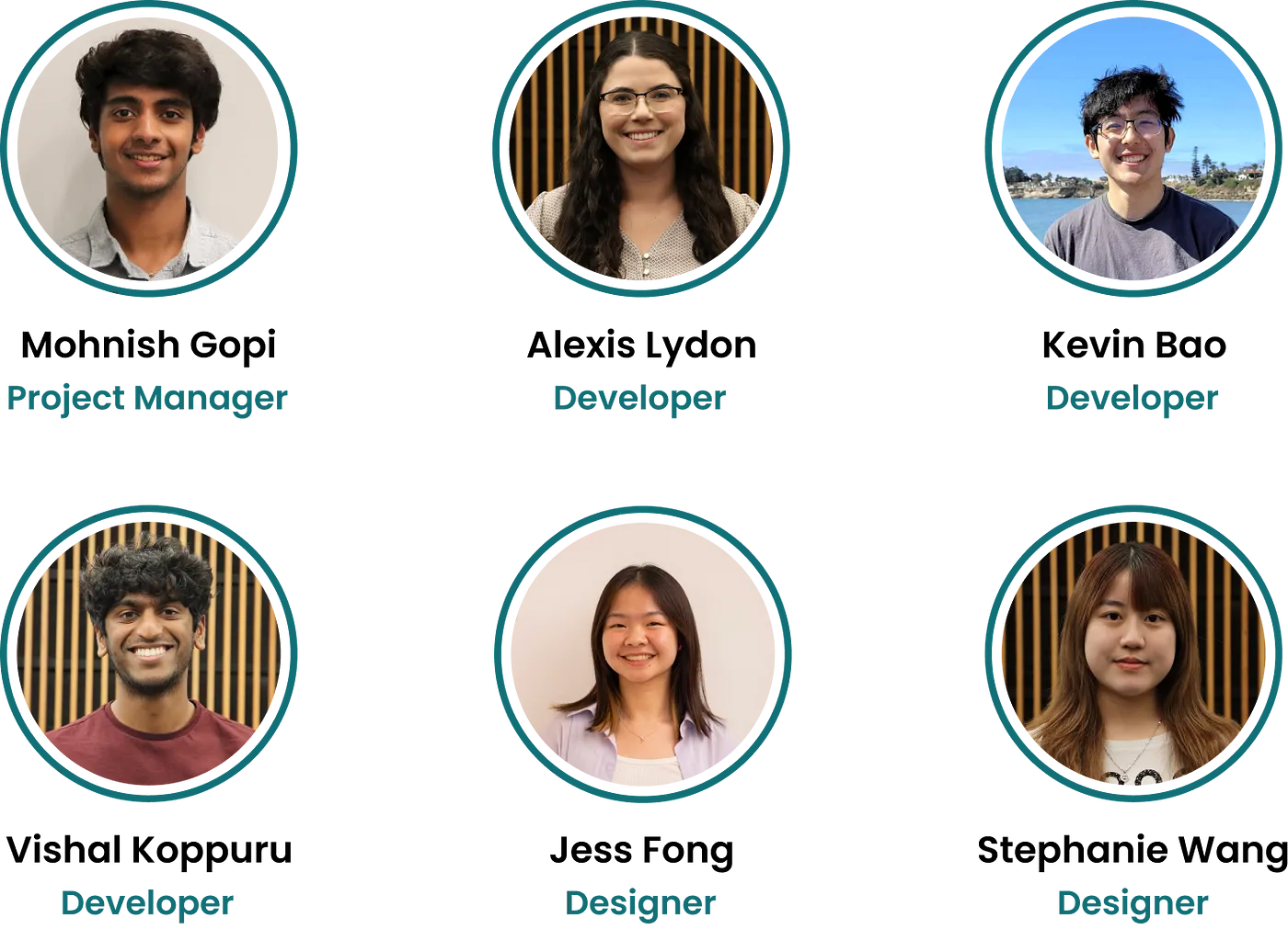
The Team
The Client
Design 2 Data is led by Dr. Justin B. Siegel and Ashley Vater, and includes forty faculty at institutions across the nation. D2D aims to make biotech research experiences accessible to tens of thousands of students who otherwise would not have the opportunity.
The research goal of D2D is to unravel the intricate relationship between protein structure and function for improved predictive tool development in the enzyme function space.
Our Task
Students in the program characterize enzyme mutants’ kinetic parameters and thermal stability and share their findings in a growing, publicly accessible database. These data are collected on spectrophotometer plate readers that run the colorimetric enzyme assays; however, not all network members have access to software that calculates kinetic rates from the raw data which poses a barrier for the network’s participation (and prospective!) faculty and students.
Our task within the framework of D2D was to develop a web application aimed at streamlining the calculation of enzyme reaction rates and generating graphs from student-generated data.
The focus was on efficiently identifying and visualizing the linear slope in absorbance data collected across several time points collected using a spectrophotometer plate reader. After this calculation, students can feed this rate data into the data submission and analysis application where they are fit to the Michaelis Menten model in d2dcure.com. Here the data are then reviewed for inclusion in the D2D Network’s published dataset.
Timeframe
September — December 2023 | 6 weeks
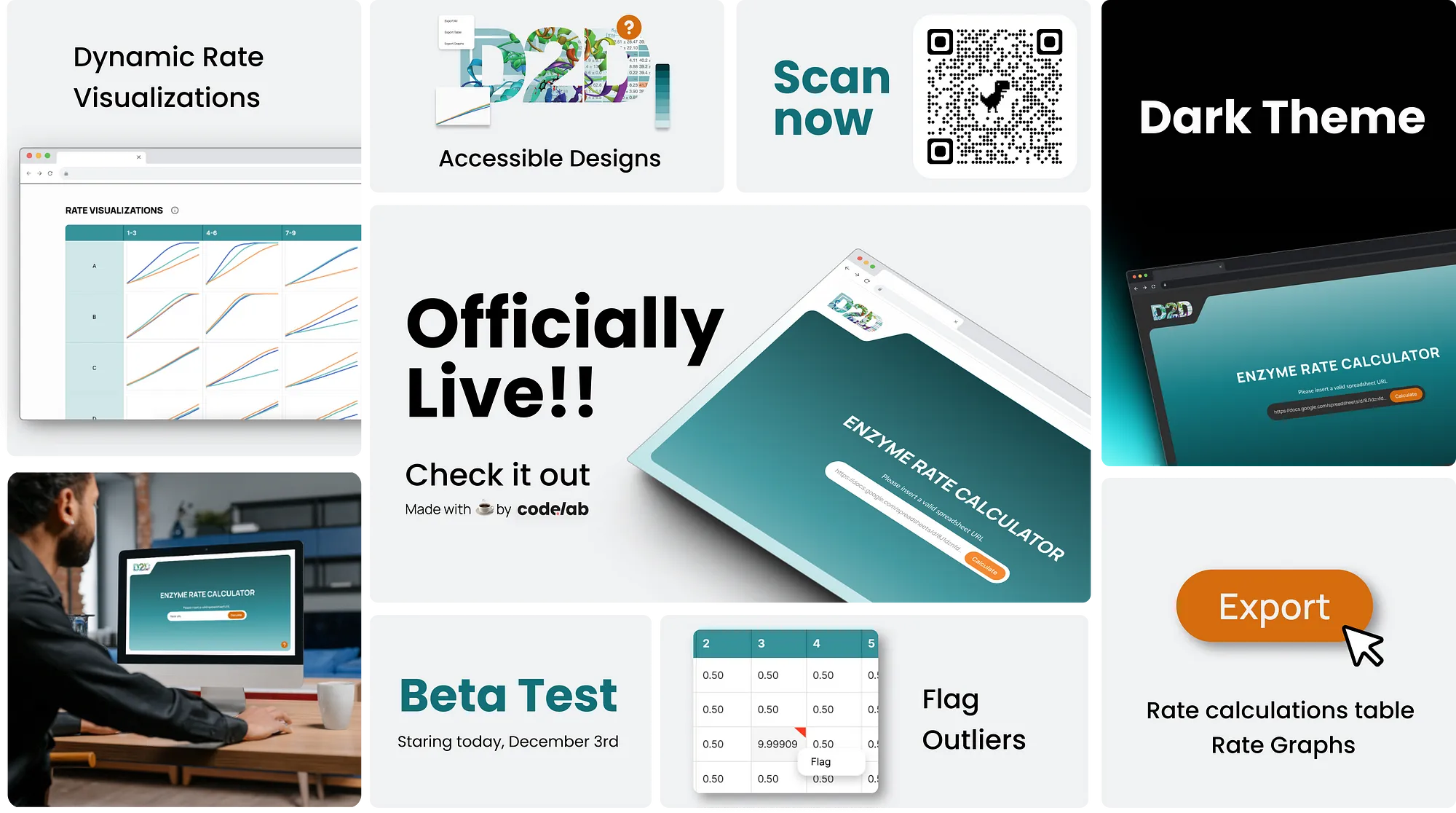
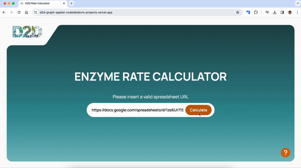
The Final Product
Link to Sample Google Sheets URL
Tools
Design — Figma
Development — React, Tailwind-CSS, Chart.js, React-Joyride
Maintenance — Jira, Notion, Slack, Github


Low-Fidelity Wireframes
Our primary goal for low-fidelity was figuring out how to lay out the data in a way that communicated the information quickly but wasn’t overwhelming. We considered different layouts for the data, some iterations with tabs for the tables and graphs and others that were both on one page. We ultimately went forward with a one page layout after receiving feedback from the client.


Mid-Fidelity Wireframes
This phase focused on refining key design elements based on user input before finalizing designs. We conducted user-testing with both people from lab and not to gain input from different perspectives. Users provided feedback on interactions, such as clicking on table cells to flag data, and suggested improvements for readability of the table and button components. Due to time constraints, we scaled down the project scope by excluding the ability to highlight graph and table cells.


High-Fidelity Prototype
Implementing feedback from our user-testing and client, we refined our design components and colors, including the development of a dark mode version. We also implemented hover states for the buttons and table cells to help guide the user with clear visual cues.


Design System
To maintain a consistent brand identity with D2D, We took color inspiration from their website that utilized different shades of teals and oranges. We used teal for the majority of the design and orange draw attention to buttons and interactions, ensuring the colors met the WCAG accessibility standards. We also utilized components for the tables and graphs for scalability and for the interactive buttons and icons to keep the design minimalistic but intuitive for the user.

We chose Manrope as our primary font because of it’s simplicity and readability that makes it ideal for our data visualizations and text. Its modern aesthetic also further enhances the overall design.


Input parsing
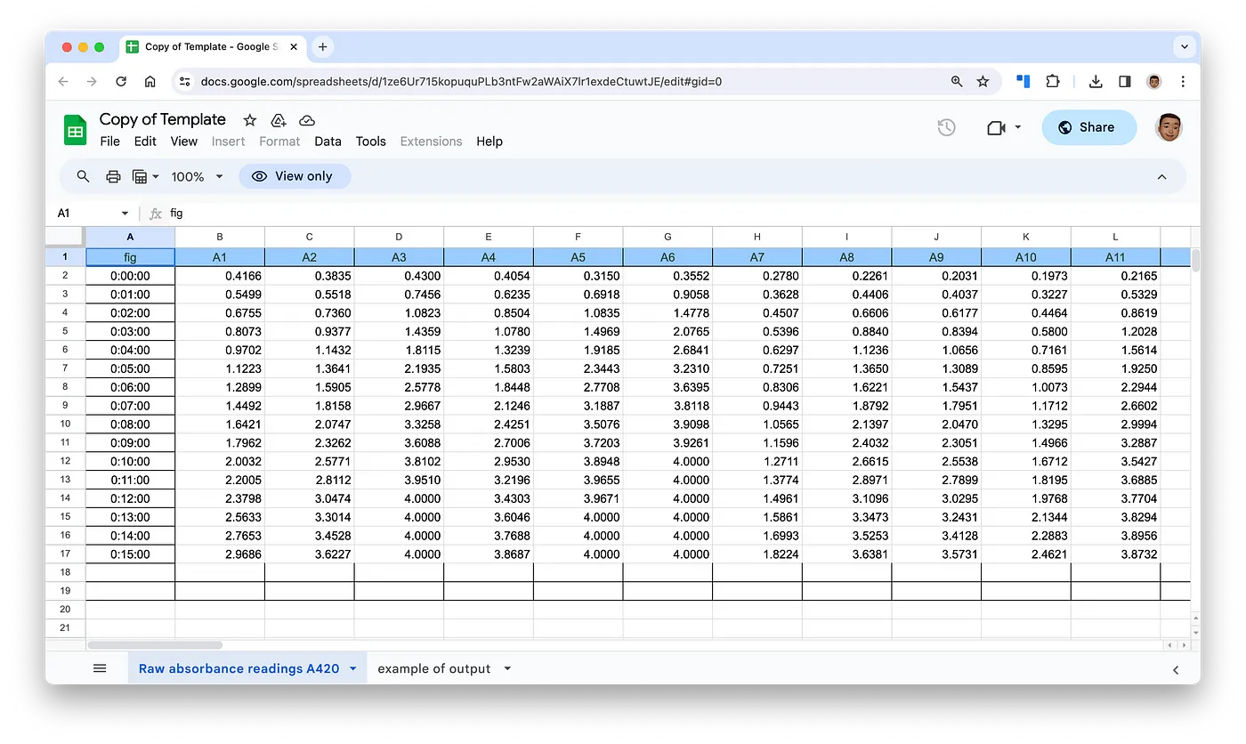
Parsing the spreadsheet data from a Google Sheet was accomplished with the public-google-sheets-parser API. After providing a sheetID, a JSON containing the sheet data is returned. The returned object stores reaction rate data as an array of JSONs, with unique combinations of a letter between A-H and numbers between 1–12 that represent each trial.
function getData(data:[]){
  const letters = ['A', 'B', 'C', 'D', 'E', 'F', 'G', 'H'];
  const numbers = ['1', '2', '3', '4', '5', '6', '7', '8', '9', '10', '11', '12'];
for (let dataIndex = 0; dataIndex < data.length; dataIndex++ ){
for (let letter = 0; letter < letters.length; letter ++) {
for (let number = 0; number < numbers.length; number ++) {
let substrate = letters[letter] + numbers[number];
// console.log(data[dataIndex][substrate]); if (dataIndex == 0) {
substrateData.set(substrate, []);
}
substrateData.get(substrate)?.push(data[dataIndex][substrate])
}
}
}
console.log(substrateData.get('A1'));
}
Rate Calculations
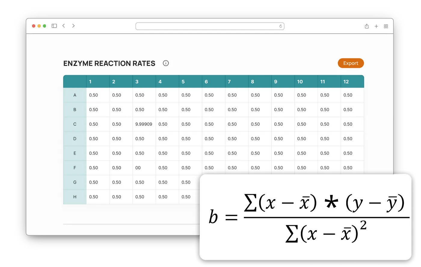
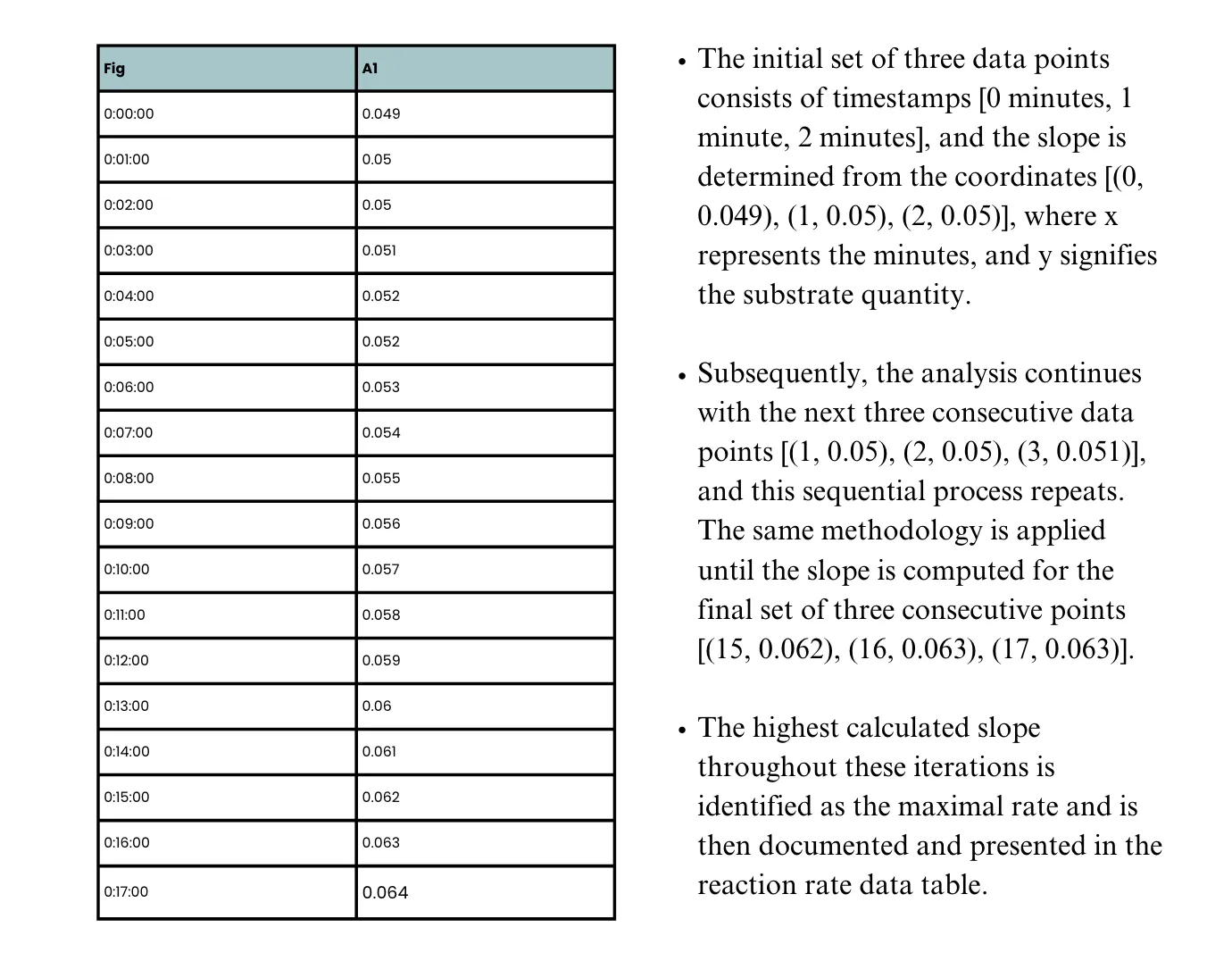
In each substrate trial, a comprehensive set of 18 data points is gathered, captured at one-minute intervals ranging from 0 to 17 minutes. The determination of the maximal rate involves the analysis of three consecutive data points, wherein the slope is derived through the application of the least squares regression. To illustrate, consider a trial conducted for a specific substrate, and let’s walk through the procedural steps involved in this process.
function maxSlope(substrateData:Map<string, number[]>, substrate:string){
  const window:number[][] = [];
  let data:number[] = substrateData.get(substrate)!;
  let maxSlope = -Infinity
  let tempSlope = -Infinity
  for (let i = 0; i < data.length; i ++){
    if (window.length < 3) {
      window.push([i, data[i]]);
    }
    else{
      tempSlope = findSlope(window);
      maxSlope = Math.max(maxSlope, tempSlope);
      window.shift();
      window.push([i, data[i]]);
    }
  }

  tempSlope = findSlope(window);
  maxSlope = Math.max(maxSlope, tempSlope);

return maxSlope;
}

function findSlope(points:number[][]) {
    let size = points.length;
    let sumx = 0;
    let sumxsquard = 0;
    let sumy = 0;
    let sumxy = 0;

    for (let i = 0; i < points.length; i++){
      let x = points[i][0];
      let y = points[i][1];

      sumx += x;
      sumxsquard += x * x;
      sumy += y;
      sumxy += x * y;
    }
    let slope = (size * sumxy - sumx * sumy) / (size * sumxsquard - sumx * sumx);
    return slope;
  }
Rendering Charts
For the project, we needed to showcase 32 graphs representing substrates’ decay rates. Leveraging the Chart.js library for its simplicity, React.js compatibility, customization options, and responsiveness, we started by creating a versatile chart component using the Line component from Chart.js. This component dynamically rendered three substrates’ rates based on props, including data from a Google Spreadsheet, x and y-axis specifications, and styling to align with design guidelines.
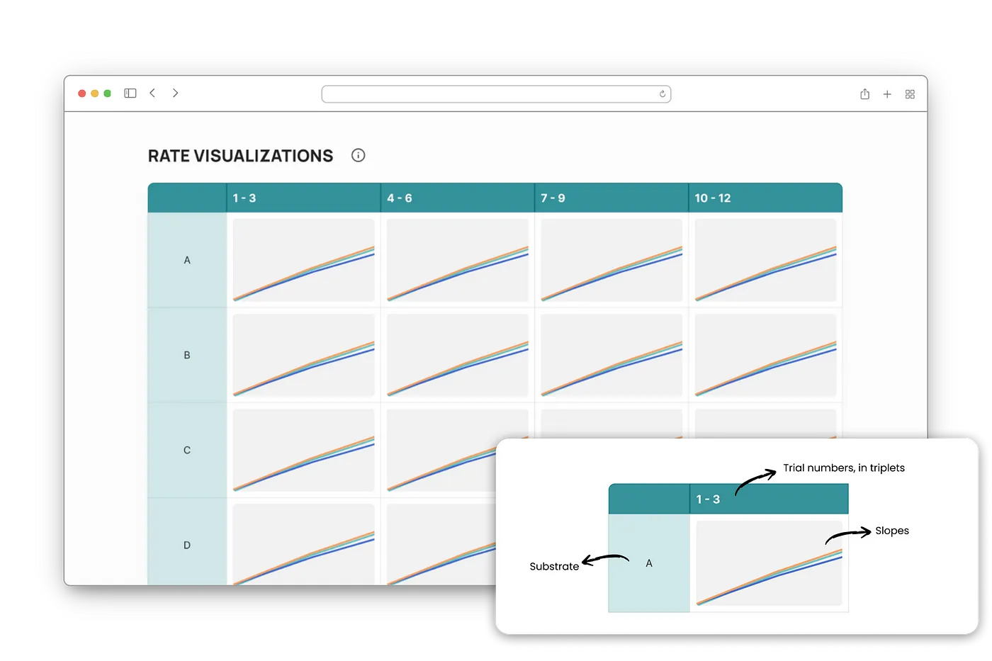
<div className="relative w-[98%]"><Graph substrateData={props.substrateData} substrates={val} title={`${val}`}></Graph></div>Once successful with a single graph, we streamlined the process for the remaining 31. Utilizing a table component, we mapped cells to their respective graphs for efficient population. Each Graph component received substrate data and names as props, residing in its div element with responsive styling. By following Chart.js recommendations for resizing, our graphs seamlessly adjusted to varying screen sizes, ensuring an aesthetically pleasing and responsive display.
Product Walkthrough
We designed the website to be as intuitive as possible, especially for new users. But, in case the user is unsure about any parts of the website, we decided to include a walkthrough that highlights important parts of the webpage and how the user can interact with it. This was implemented using React Joyride, a React library for guided tours of a webpage. The tour works by applying a spotlight on an element in the webpage, and provides useful notes for the user.
We started with getting React Joyride integrated with our app, which required some thought in terms of managing states relevant to the tour setup and passing it to the right components on the page. Then, we setup the steps of the tour, which highlights the workflow of the app. It starts with the user input for the Google Sheets URL, then after displaying some useful information about finding the correct link to upload, the tour highlights the rest of the app including the table, graphs, and how the user can interact with these and download them if desired.
We also added a documentation to simplify the learning process and for easier distribution to users.
Challenges
Development
- Parsing/Storing Data Efficiently:
One of the initial challenges was that we had to devise efficient algorithms and data structures to ensure seamless data processing and storage, avoiding bottlenecks that could hamper performance. - Integrating Chart.js with Vite:
The decision to use Chart.js for data visualization came with its own set of challenges, especially when integrating it with the Vite build tool. - One Developer less:
Losing a team member midway through the development phase was an unforeseen setback and the team had to redistribute workloads. - Limited Data:
Working with limited data presented challenges in accurately simulating real-world lab scenarios. As a result, we were unable to refine or fine-tune the model to different input scenarios.
Design
- Lack of User Testing:
The absence of thorough user testing became apparent during the later stages of design. This oversight led to issues that could have been identified earlier through user feedback. - New Design Practices:
Adopting new design practices introduced a learning curve for designers unfamiliar with creating UI/UX for scientific applications. The transition necessitated training and adjustment to unfamiliar methodologies. - Accessibility in Mind:
Integrating accessibility considerations into the design process was a critical aspect we overlooked. The designers had to reassess the software’s design and functionality to ensure it was inclusive and accessible to all users.
Takeaways
- Importance of Work Environment: Among the various teams I’ve been a part of, this one was notably enjoyable. It felt more like collaborating with a close-knit group of friends to create something exciting, rather than adhering to the typical work setting. Building friendships within this team proved to be one of the most rewarding aspects of this experience.
- Client Communication: It’s not always just about coding; it’s about really getting what our clients want. Keeping them in the loop and making sure we’re on the same page builds a solid foundation of trust. Even though none of us were bio lab experts, we took the plunge and reached out to our client multiple times to get the basics right. Big shoutout to Ashley for being an amazing client throughout.
- Feedback is Key: Feedback was our secret sauce, coming from both our team and external sources. The client’s feedback guided us on our development journey, making sure we’re spot-on with user expectations. And even though lab testing didn’t pan out, big thanks to our professors and CodeLab pals for their game-changing feedback! No matter how many hours you ideate with your team, someone else’s perspective can sprinkle magic on your product, so keep those ears wide open!
- Staying Organized: Organization isn’t just a buzzword; it’s a practical necessity. We hopped on the project management tools, version control, and meeting notes train because it seemed like the thing to do. Little did we know how much it would actually help us when things got crazy towards the end. It taught us the importance of sticking with being organized, and you can bet we’re keeping it up from now on.
- Learning Never Stops: It might sound a bit contradictory, but our team worked well together not only because we shared a lot in common, but also our uniqueness. Each of us brought our own special talents to the table, yet there was never a hint of showing off — it was always about embracing and learning from one another. No matter our roles, we seamlessly worked together as a unit.
Closing Remarks ✨
As we wrap up our D2D project journey, it’s a moment to reflect on the challenges we faced, the lessons we learned, and the bonds we forged. From parsing and storing data efficiently to integrating third-party libraries and overcoming unexpected setbacks, each challenge played a crucial role in shaping the final product. If you made it this far into the article, I appreciate it because you’ve just read about a journey that wasn’t always lines of code and pages of Figma. We shared many good memories, lots of laughter, and learnings that we will cherish forever.