Mythical Society
Introduction

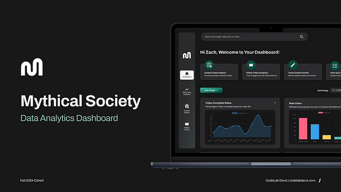
Mythical Society, created by Rhett & Link of Good Mythical Morning, is an exclusive membership platform offering fans behind-the-scenes content, unique collectibles, and a space to interact with both the creators and fellow fans in meaningful ways. However, their non-technical team faces challenges in interpreting data collected from multiple analytics platforms, leading to complexity and confusion. To address this, we developed a unified, user-friendly dashboard that consolidates key data points from all their analytics tools. This solution empowers the Mythical Society team to easily access insights, streamline decision-making, and refine their content strategy effectively.
The Team

Timeframe
October — December 2024 | 6 weeks
Tools
Design — Figma, a collaborative cloud-based design tool
Development
- Frontend: React, Vite, Material UI, Chart.js
- Key APIs: GoogleOAuth2.0, Google Analytics, JW Player
- Database: MongoDB
Maintenance — Jira, Notion, Slack, Google Meet, Smoke Signals & Carrier Pigeons.
The Project — Design
User Research
Problem: Currently, Mythical uses a combination of tools such as Firebase, Google Analytics, and JW Player to track and analyze user activity, video engagement, and traffic sources. While these tools provide useful data, the current workflow for accessing, analyzing, and reporting insights is fragmented, inefficient, and lacks the level of customization required by different teams within the organization.
We came up with a few HMW statements to understand exactly what it is that we could do for the Mythical team.
How Might We Statements:
- How might we create a data analytics dashboard that integrates data from pre-existing sources (Firebase, Google Analytics, and JW Player)?
- How might we report key metrics with intuitive visualizations of user data?
- How might we make our platform more relevant to the day-to-day usage of the various positions and teams?
Competitive Analysis
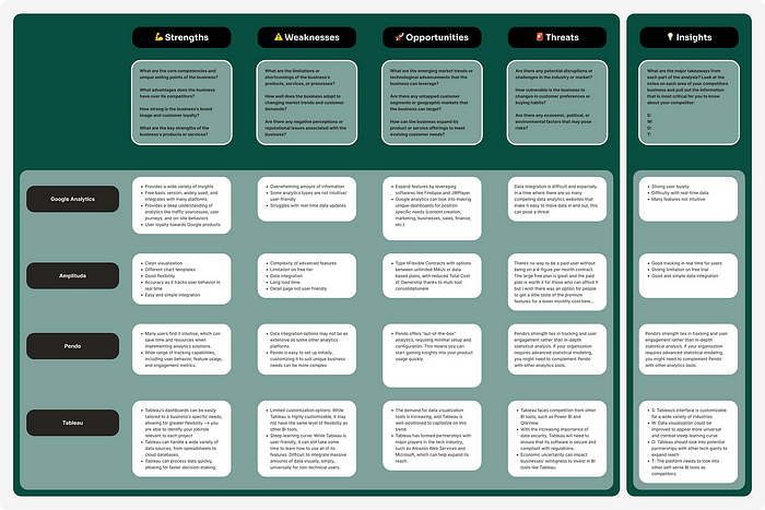
We began our research process by conducting a competitive analysis to examine the existing data-analytics management products in the market. Through our research we observed that our competitors offered a diverse set of tracking capabilities including: user behavior, feature usage, engagement metrics, and demographic metrics. Current products on the market have powerful features that are able to integrate data from diverse sources, offering robust functionality for all sorts of business needs. However, many platforms pose challenges for users with non-technical backgrounds due to steep learning curves and complex interfaces. Additionally, a significant gap exists where these solutions fail to address the specific needs of our client at Mythical Entertainment, highlighting opportunities for tailored innovation.
Key Findings from Competitive Analysis:
- Challenges for non-technical users
- Dashboard not customizable enough for team
User Interviews
Diving into user interviews, we created our questions with the goal of learning more about the Mythical Team’s current experiences with pre-existing dashboards and how it can be improved to help them fulfill their roles.
In total, we conducted 4 interviews with team members who will be utilizing the data-analytics dashboard most frequently. Each interviewee was asked questions about their overall impressions and had to conduct three tasks to gauge their current proficiency with JW Player and Google Analytics
- User Trends: “Navigate to the section that displays user feedback over the past 42 days. Can you identify any trends in positive or negative feedback? Please share any frustrations you experience while accessing this data.”
- Traffic Sources: “Look at the traffic sources and identify which source brought the most visitors to the site last week. (I.e. phone v. desktop)”
- Video Engagement: “Look at the video engagement section for the video titled ‘’Rhett and Link React | I’m a thoughtful guy”. Please find out how many remaining viewers were left at the end of the video at minute 10:10.”
Through the interviews, we gathered the following key takeaways:
- The databases the team currently uses lacked customizable data points on the home dash.
- Much of the language used in the dashboards was too technical and made no sense to the team.
Pain Points
From the interviews, we also identified key pain points in their existing analytics platforms and gained a deep understanding of their specific user needs:
- Available data is “bare bones” and not helpful
- Confusing terminology on the dashboard lacks context
- Challenging to pinpoint specific user data
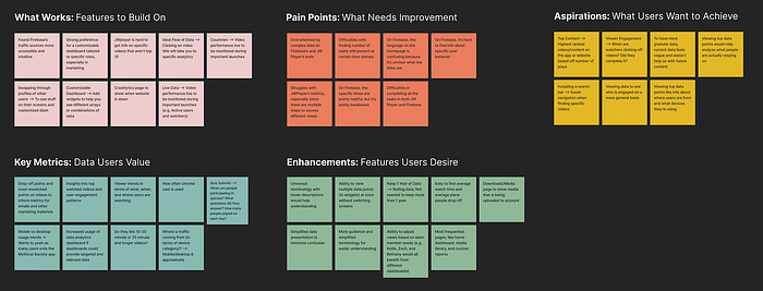
Using the HMW statements and all our previous work, we narrowed down the most important features that users would need in an application of this caliber:
- Simplified data breakdown and visualization
- Customizable widgets on each user’s home dashboard
- Ability to create multiple custom reports
- View of other team members’ dashboards
Sketches
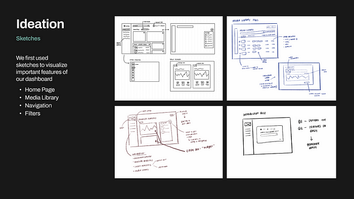
We began by individually creating digital and traditional sketches of our interpretations of the dashboard. Our design team then met up to discuss strengths and weaknesses of each approach.
Low-Fidelity
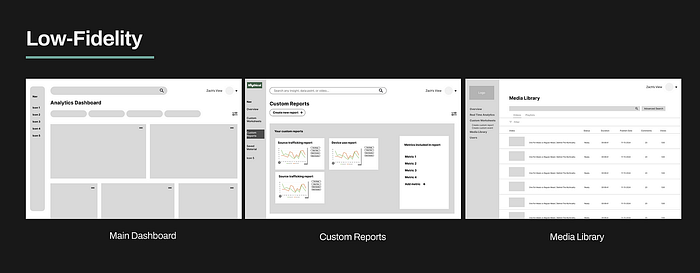
These low-fidelity screens display the home dashboard, custom reports, and media library. We focused on the functionality of these pages at this stage.
Transitioning to Figma, we developed low-fidelity designs to quickly explore ideas, establish the structure of the interface, and align on the overall user flow. Our biggest goal in this stage was establishing the general format of the homepage.
We decided on a prominent search bar at the top of the screen to make video searches more intuitive. Additionally, we designed placeholder quick actions for easy navigation and included a dedicated button to toggle between team member dashboards, ensuring seamless access across roles.
Mid-Fidelity
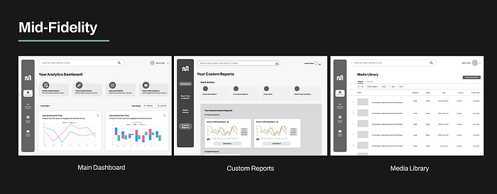
These mid-fidelity screens have a horizontal as well as vertical navigation. We also added a media library and updated the navigation on the left-hand vertical menu.
In the mid-fidelity stage, we elevated our low-fidelity prototypes by adding detailed elements, including concrete text and graphs created with Chart.js. Regular meetings with our developers ensured feasibility, allowing us to refine the scope of our designs to align with the project timeline. Additionally, ongoing check-ins with our stakeholder provided valuable feedback, guiding improvements in each new iteration.
Design System
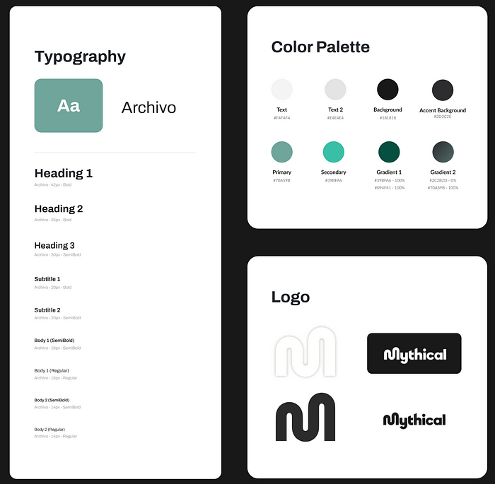
Following the mid-fi stage, we developed a design system to match the Mythical Society’s branding and design guidelines. We used their existing logo to make everything feel cohesive and familiar. We used teal as our primary color, inspired by the current colors on the Mythical brand guide. Archivo, taken from the Mythical design system, was chosen as our main font, offering a playful yet sleek look to the website.
Hi-Fidelity
With feedback from our low-fidelity and mid-fidelity designs, we transition to high-fidelity prototypes, where the visuals, branding, and interactive details come to life.
Home Page Organization

For the homepage, our goal was to minimize the cognitive overload often associated with traditional data analytics dashboards. To achieve this, we incorporated a row of “quick action” buttons at the top of the screen, designed to encourage intuitive user interaction and streamline navigation.
- In order to assist collaboration between Mythical Entertainment positions, clicking on the account profile will allow you to view other team member dashboards.
- The floating navigation bar is designed to be compact, taking up minimal space to maximize the area available for each widget on the dashboard.
Creating a Widget
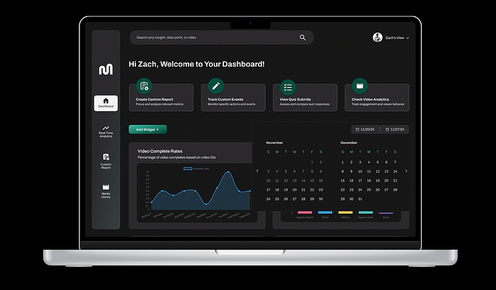
- On the homepage, each box is referred to as a widget. A widget is a mini-report that can display your data in a number of presentation styles, including simple numeric metrics, tables and charts.
- You can use the date range button to change the time period of all widgets on your dashboard at once. Alternatively, clicking on an individual widget will allow you to create more specific edits.
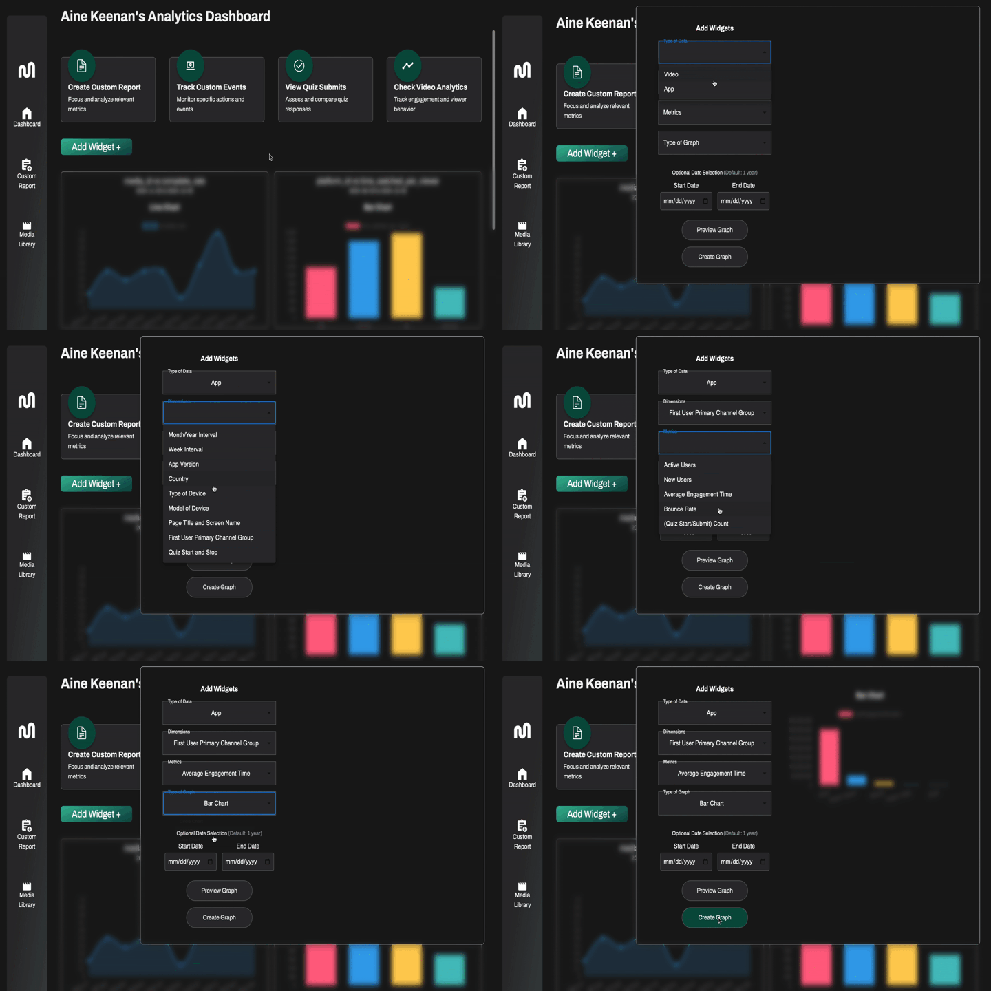
- To add a widget, press the “add widget button” and input the data type, dimensions, metrics, and preferred graph. Users can preview the graph prior to adding it onto the main dashboard.
Custom Report Page

On the custom report page, you are able to create a new report through submitting custom dimensions, metrics, and time period.
- You are also able to access previously made reports through clicking on the “View Saved Reports” button.
Media Library
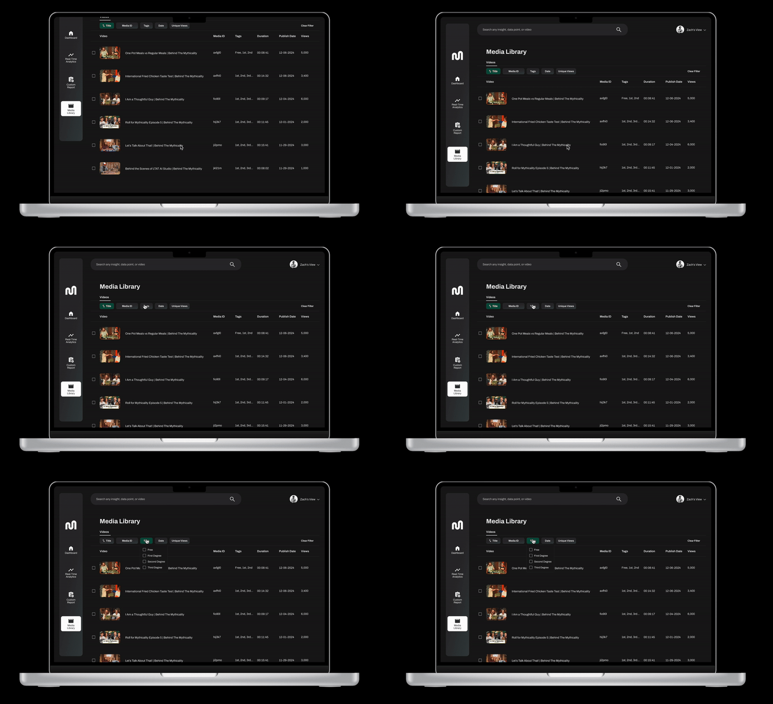
The media library allows the user to easily find any video needed to find analytics on.
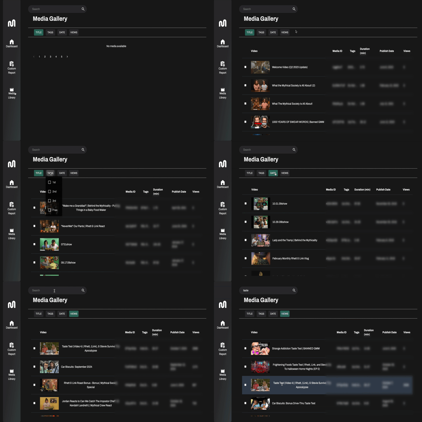
The media library shows an overview of all videos on the Mythical Society platform. Users can search for unique videos through the search bar or utilizing filter categories.
- Each row shows information about a video’s Media ID, Tags, Duration, Publish Date, and Unique Viewers.
- Through clicking on an individual video, you are taken to a secondary page with specific video statistics for analyzing success of the content.
Development — Backend
Authentication Process

The authentication process uses Google OAuth2.0 and JSON Web Tokens (JWT) for secure user access. When a user attempts to access their dashboard, they are redirected to the Google OAuth2.0 consent screen. After logging in and granting permissions, the consent screen returns an OAuth code and user information to the client. This data is sent to the backend server, which validates it and generates a secure JWT. The token is then returned to the client, enabling authenticated access to the user’s dashboard and ensuring a secure session for subsequent requests.
Express Routing
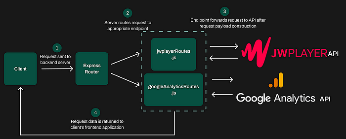
The backend for this project is built using Express.js to efficiently handle data requests from Google Analytics and JW Player APIs. When a client sends a request to the backend server, the Express Router directs the request to the appropriate route, either jwplayerRoutes.js or googleAnalyticsRoutes.js. Each route constructs the necessary payload and forwards the request to its respective API. Once the API responds, the retrieved data is sent back to the client’s frontend application.
Google Analytics: Handling Custom Reports
The Google Analytics route /custom-data accepts a POST request containing dimensions, metrics, and an optional date range.
Input Validation: The route checks if dimensions and metrics are provided, returning a 404 error if they are missing. If no start or end date is specified, defaults of 30daysAgo and today are applied.
Fetching Data: The runReport function constructs the API payload by formatting dimensions and metrics into the required structure. Using the analyticsDataClient.runReport method, it queries the Google Analytics API for the specified property ID and date range.
This implementation allows users to request highly customizable Google Analytics reports by specifying different combinations of dimensions and metrics.
JW Player: Fetching and Saving Video Analytics
The JW Player route /fetchCustomReportData is parameterized to fetch or save video analytics reports.
Request Parameters: The client sends start and end dates, dimensions, metrics, and optional filters in the POST request. A saveReport flag indicates whether the data should be saved to MongoDB.
Fetching Analytics: The route constructs the API payload and sends a POST request to the JW Player analytics endpoint using axis. Query parameters like source, format, and headers ensure the API request conforms to JW Player’s specifications.
Saving Reports: If saveReport is true, the data is saved to MongoDB as a CustomReport entry. Each report includes dimensions, metrics, date range, and data rows.
How the System Works Together
The Express Router directs client requests to the appropriate route file ( googleAnalyticsRoutes.js or jwplayerRoutes.js) based on the endpoint. Each route:
- Validates input and constructs API requests dynamically.
- Retrieves data from the respective analytics platform.
- Optionally processes or stores the data (in JW Player’s case).
The modular approach ensures clean separation of concerns, making the backend easy to maintain and extend. Whether fetching detailed Google Analytics reports or saving video analytics data from JW Player, this architecture efficiently manages analytics data integration and retrieval for the user.
Database and Schema Design

Dashboards
The database structure for the project leverages MongoDB to store and manage global dashboards effectively. Each dashboard is a collection of graphs, along with their associated metadata, providing a highly flexible and scalable solution. The Dashboard Schema includes attributes such as name and a list of graphs, while the Graph Schema further defines each graph with details like chartType, dimensions, metrics, dateRange, dataSource, and transformedData. This structure allows individual users to have their own dashboards, which can also be shared and viewed by other team members, ensuring collaboration and personalized data visualization for all users.
Custom Reports
In order to save custom reports to MongoDB we created a system which balances flexibility and efficiency, which allows for either on-demand data retrieval or persistent storage for future use.
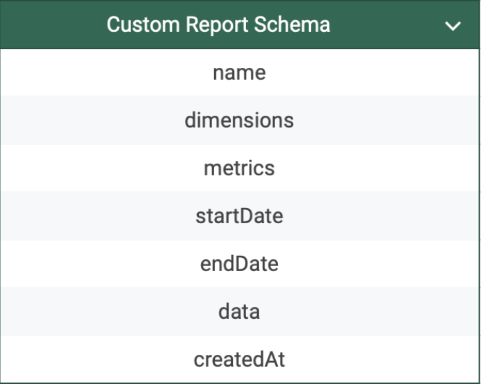
At the center of this functionality is the customReportSchema, a Mongoose schema that defines the structure of a report with fields like name, dimensions, metrics, startDate, endDate, and data. A createdAt timestamp ensures each report is time-stamped automatically.
The Express route /fetchCustomReportData accepts POST requests containing query parameters such as dimensions, metrics, date ranges, and the saveReport flag. It sends these parameters to JW Player’s API using axios, dynamically constructing the request payload to fetch analytics data.
If the saveReport flag is set, the route creates a new CustomReport instance with the fetched data and persists it to the database using Mongoose’s save() method. Otherwise, the data is returned directly to the client. This approach lets us reuse our existing route for JW Player to be more robust to be used for both sending data to the client and saving data to MongoDB.
Development — Frontend
Dashboard
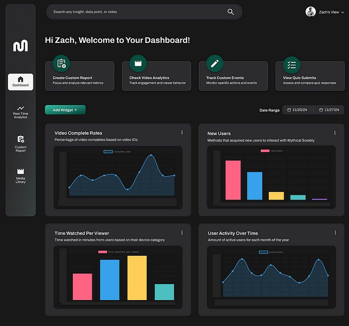
The dashboard page serves as a central hub for users to visualize and analyze key metrics. Each dashboard is fully customizable, allowing team members to tailor it to their specific workflows by selecting the data most relevant to their needs, such as video completion rates, new users, time watched per viewer, or user activity trends. Dashboards and their associated graphs are stored in MongoDB, enabling a collaborative experience where any team member can access and view global dashboards created by others. This approach ensures flexibility for individual users while promoting a shared understanding of key insights across the team.
Widget Creation
The dashboard uses a sophisticated widget creation paradigm that gives the user fine granular control over which data they want to see in their dashboard.
A context menu with customizable fields like —
Type of Data: This allows the user to view data from either Google Analytics or JW Player
Dimensions: Based on the selection from the Type of Data field this drop down menu will be populated with dimensions relevant to the field that was selected
Metrics: Similarly, based on the selection from the Type of Data field this drop down menu will also be populated with Metics that are related to the field that was selected
Type of Chart: This field gives the user finer control over the customization of their dashboard by allowing them to select the way the data is visually represented to them. Our platform gives the end users the option to see data visualized in a bar chart, circle chart, or line chart.
Date Ranges: In this field the user selects the date ranges that they want there widget to represent. There is a slight caveat that with JW Player the date range is limited to 90 days.
These fields and the widget creation menu give the end user the ability to fine tune the data and view of their dashboard in a seamless and user friendly way.
Media Library
The Media Library page provides a seamless way to browse, filter, and interact with video content. To overcome the limitations of JW Player’s slow API performance when fetching large datasets, we implemented a backend solution that integrates MongoDB as a caching layer. A weekly cron job pulls the latest video data, including titles, tags, durations, publish dates, and views, from JW Player and stores it in MongoDB.
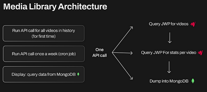
Here’s how it works:
Every Sunday at midnight, the cron job triggers and calculates a date range covering the past seven days. It uses the axios library to send a POST request to the API endpoint api/jwplayer/fetchGalleryAndStats, passing the start_date and end_date as parameters. The API returns an array of media statistics, including details like mediaId, title, thumbnail, tags, duration, publishedDate, plays, uniqueViewers, and timeWatched.
Once the data is received, the script bulk inserts all the data into MongoDB using the insertMany() function from mongoose.
The use of MongoDB as a caching layer ensures the frontend is always synced with the latest data while taking advantage of MongoDB’s robust querying capabilities. Users can efficiently search, filter by tags, and sort videos, enabling quicker access to insights and better user experience.
Media Summary
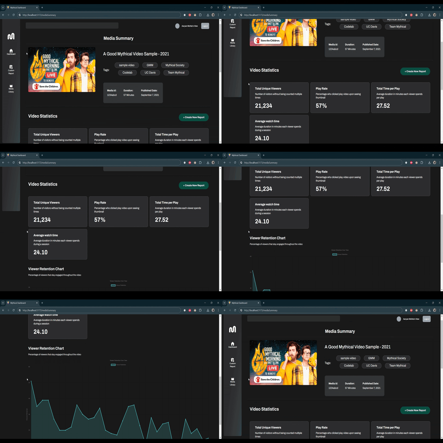
The video summary page provides an in-depth breakdown of a specific video’s performance, with data sourced from JW Player via our backend server. The backend, built with Express, acts as a middleman, handling API calls to JW Player to retrieve metrics like total unique viewers, play rate, total time per play, ad clicks, and completion rates. These statistics are processed and delivered to the frontend seamlessly. The page also features a viewer retention chart, visually showcasing audience engagement over time. This design ensures real time access to accurate data and allows for streamlined analysis to improve content strategy.
Key Features
Data:
- Total Unique Viewers — Number of unique viewers that engaged with the video
- Play Rate — What percentage of viewers, given the video was displayed to them, clicked on it.
- Total Time Per Play — Average duration each user spent per play
- Average Watch Time — Average time that a user spent watching the video. This includes duplicate views.
Viewer Retention Graph: This graph visually highlights the percentage of viewers that made it to any given point of the video. This allows the end user to see what points in the video made the viewers drop off the most, giving them actionable insight as to what content engage users the least.
Report Creation: A “Create New Report” button is available to allow users to generate custom reports directly from the current video’s analytics. Clicking this button redirects to a report creation page, pre-filled with the current video’s mediaId.
Custom Reports
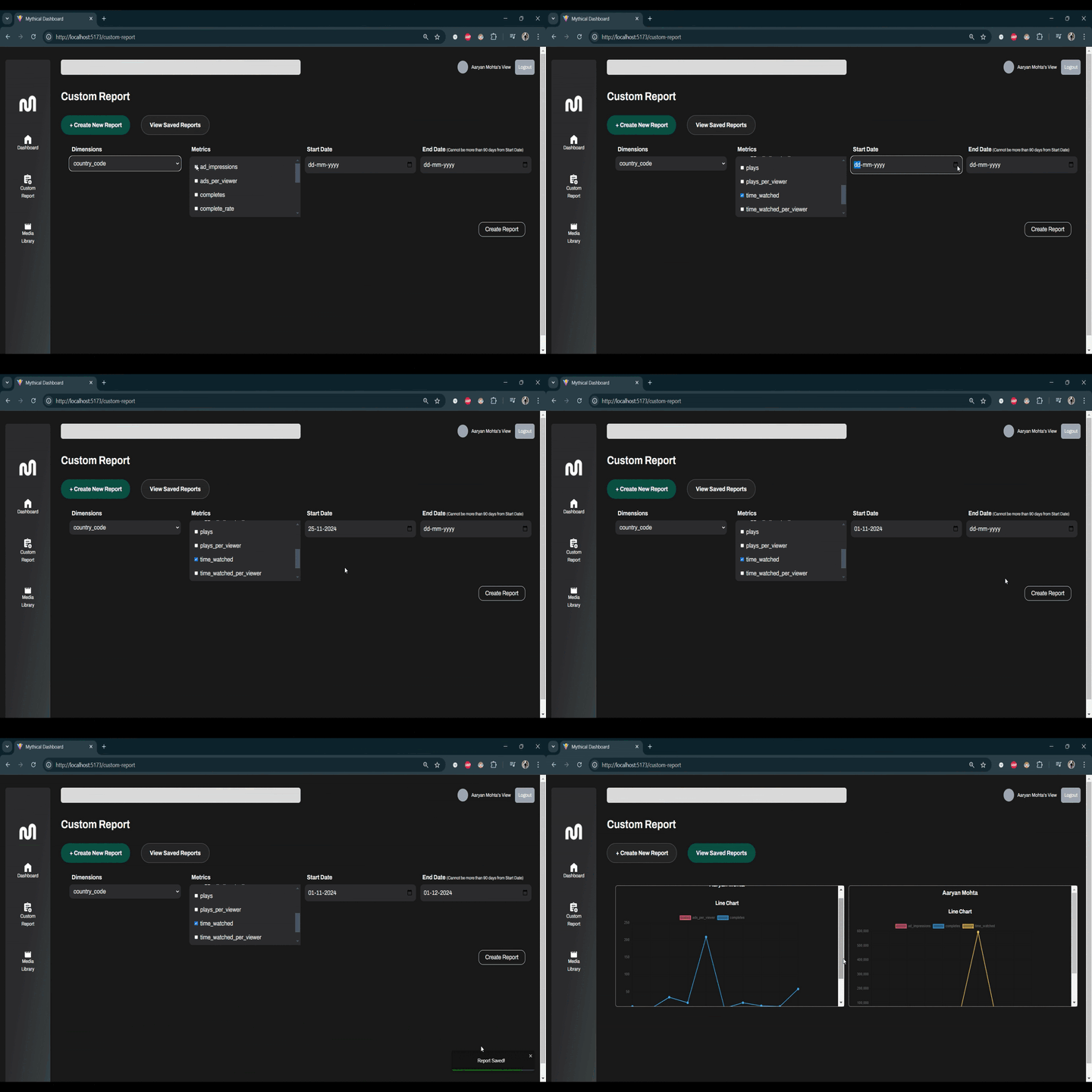
The Custom Report page in this application empowers users to create, view, and manage custom analytics reports based on JW Player data. This page features an intuitive and interactive design to streamline the reporting process, enabling users to select dimensions, metrics, date ranges, and filters to customize their reports.
Report Creation
The primary function of the Custom Report page is to facilitate the creation of new reports. Here’s how it works:
Dynamic Inputs: Users can select dimensions (e.g., country_code, media_id) from a dropdown, providing the foundation for report aggregation. Metrics (e.g., ad_impressions, plays, time_watched) are displayed as checkboxes, allowing users to choose multiple metrics simultaneously. The Start Date and End Date inputs define the time frame for the report. Validation ensures the date range does not exceed 90 days, aligning with API limitations.
Optional Media ID Filter: If the media_id dimension is selected, a dedicated input field allows users to filter the report for a specific video. This flexibility enhances targeted analysis.
Backend Integration: Upon clicking Create Report, the selected inputs are sent to the backend via a POST request to the /fetchCustomReportData endpoint. The backend fetches data from JW Player’s analytics API, processes the results, and saves the report to the database if the user opts to save it.
User Feedback: The page uses react-toastify to provide real-time feedback. Success notifications confirm report creation, while errors are displayed with descriptive messages.
Viewing Saved Reports
Users can toggle to the “View Saved Reports” tab to access previously generated reports.
Report Retrieval: Reports are fetched from the backend and displayed in a grid layout, each containing the report name, a data visualization, and raw JSON data.
Interactive Data Visualization: Each report includes a line chart (powered by the LineChart component) that visually represents the selected metrics over time or across dimensions.
Deletion Functionality: Users can delete unwanted reports via the Delete Report button. This sends a DELETE request to the backend and removes the report from the list without requiring a page refresh.
The Custom Report page is a powerful tool for users to generate actionable insights. By combining intuitive design, robust backend integration, and dynamic data handling, it ensures that creating and managing reports is a seamless experience. This functionality is invaluable for users seeking to analyze their video performance and make data-driven decisions.
Todos
While we did a lot of great work on this project there were a few features that had to cut for one reason or another. Here are a few features that we had ours eyes set on.
Exporting Data: As mentioned previously the ability to export data from a users dashboard or custom report was a feature we had aimed to get done. This would have required us to format and parse the data from our platform into a .csv file for the end user to view.
Live Data: Currently our platform shows a static snapshot of our clients analytics at the time of page load. A nice feature would have been to have data update in real time as the user is viewing the page. This was out of scope for us since it would have required branching out further into the API’s of both JW Player and Google Analytics.
First Time User Login Survey: We initially wanted to have a first time user login survey wherein when an end user logs-in they will be prompted with a survey which ask them questions like “what is your job title”, “what data is more relevant to you”, and so on. This feature would have streamlined the creation of a users dashboard by creating one for them automatically given their selections on the survey. This feature proved to be cumbersome as it required experience in data analytics and having domain knowledge on what metrics/dimensions are relevant to each job title.
Takeaways & Challenges
Constant Communication
One of the key challenges we faced was ensuring clear communication between the design and development teams. Early on, there was a fundamental misalignment regarding the implementation of widget creation. While developers had one interpretation, designers envisioned something quite different. This disconnect led to friction when trying to reconcile these differing perspectives as deadlines approached. Ultimately, due to time constraints, we had to proceed with the developers’ initial implementation. This experience highlighted the importance of constant communication and alignment throughout the project to avoid such last-minute complications.
Working on Key Features Early
Another significant takeaway was the importance of prioritizing key features early in the project lifecycle. For instance, the ability to export data into a .csv file was a feature we had to cut because of time limitations. By the time we turned our attention to this feature, the accumulated technical debt made its implementation infeasible within our time constraint. Had we considered and planned for it earlier, it could have been integrated seamlessly. This experience underscores the value of early feature planning and prioritization to avoid missing out on essential functionality.
Setbacks
Early in the project, we encountered a delay in conducting user interviews, which were critical to understanding our client’s needs and the shortcomings of their current analytics tools. Due to scheduling conflicts during a busy period for the client, these interviews had to be postponed. While this was a challenge, we appreciated the client’s dedication to their craft and adapted by pivoting to other tasks during that time. Ultimately, we were able to conduct the interviews later and gain the insights needed to guide the project. This taught us the importance of flexibility and patience in client collaboration.
Closing Remarks
Special thank you to Mythical Society for collaborating with us on this project and an even bigger thank you to Zach Miller from Mythical Society for being an awesome client representative. We here at CodeLab will always embody a synergistic coalescence of curiosity, creativity, and tomfoolery, experienced through friendship and intended to bring goodwill to the universe — which is to say be Mythical ❤️.
And a final thank you to you, the reader, for making it this far.
