Training Tool
2022–2023 Yearlong Spark Project
Introduction
CodeLab is a student-run software and design agency at UC Davis. Currently, CodeLab uses Notion in order to provide cohort bootcamp materials to CodeLab associates. Notion has several limitations for presenting CodeLab curriculum. We think there is a better way to educate associates that improves the organization of bootcamps, increases the engagement of users, and allows admin users to track associate progress. Our goal is to build an online learning platform for CodeLab members to create and consume CodeLab educational material.
The Team

Project Managers: Derek Ma, Caden Newton
Designers: Divya Gautam, Jessica Park, Meleah Phillips
Developers: Thea McCallie, Ibrahim Rizk, Sophia Tzonev, Kaitlyn Vo, Chris Gaw, Catherine Chen, Ayushi Bhatnagar, Parsa Bazargani, Vishal Koppuru
Timeframe
Fall Quarter: Oct 2022 — Nov 2022 | 6 weeks
Winter/Spring Quarters: Jan 2023 — Jun 2023 | 15 weeks
Tools
Front-end: React.js, Next.js, Mantine, Tiptap
Back-end: MongoDB, Node.js, Express.js, AWS S3
Design: Figma
The Project
Design
User Research
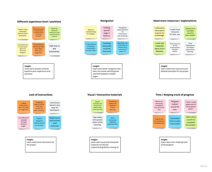
Designers collectively created an elaborate and holistic survey that sought to collect feedback regarding the current Notion-based training system. In addition, they were also able to conduct one-on-one interviews with all types of associates in order to address pain points specific to a particular role’s training material. To organize their research findings, they’ve developed the following affinity map.
Competitive Analysis
Following user research, the designers conducted a thorough analysis of three different competitors that were consistently brought up in survey responses.

Problem Statement
After compiling the most common user pain points: troublesome navigation, difficulty of progress tracking, lack of skill variation, and lack of guidance, the designers established a problem statement as follows…
💡 How might we build an intuitive and organized tool that is accommodating to each role and experience level of the CodeLab members?
User Personas
Based on the problem statement, the designers were able to compile a brief list of user personas who might be inclined to utilize our product. These personas represented the associates of CodeLab and their differing experience levels, roles on the cross-functional team, personalities, and most importantly, learning styles.

Low-Fidelity Sketches
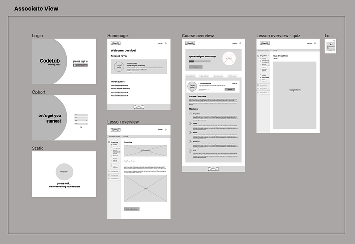
The designers began with the associate’s perspective and created low-fidelity sketches of the log-in, authentication, and course pages. They started to build a vision for the product and experiment with different potential features and their placement within the frames.

Flow Maps
Since there are three different types of users to design for, the designers created three different flow maps to represent each of the user experiences. This map was an effective way to communicate with the developers about the required frames for the product.

Mid-Fidelity Design
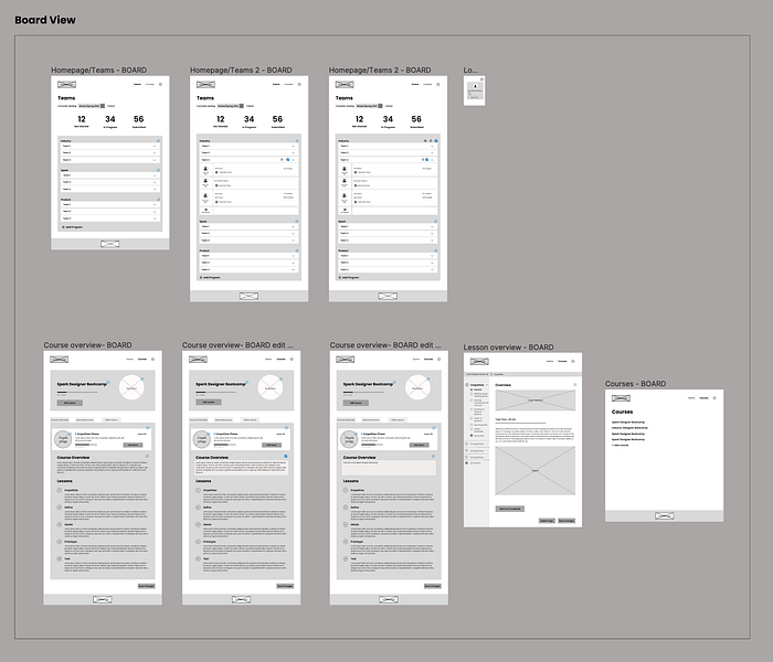
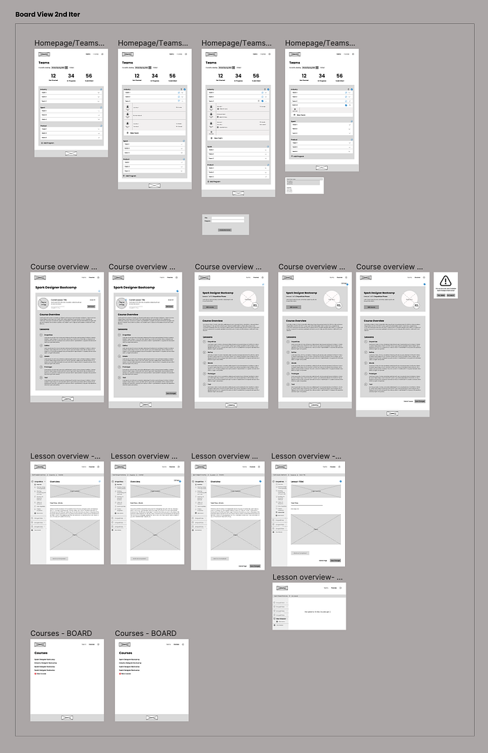
After working closely with the development team to confirm the feasibility of all potential features, the designers created the following mid-fidelity wireframes. Multiple iterations were conducted during the Mid-fidelity Design phase because the designers experimented with several variations of the layout to find what will be best for the user. The design team focused on the associate pages first for the Courses development team and once the Mid-fidelity frames for that segment of the product were completed, they transitioned onto the PM and Board frames for the Access development team.


Mid-Fidelity User-testing
To ensure the quality of the product, the designers conducted user testing in between iterations of their Mid-fidelity Design phase. This is a way to ask potential users for feedback and critiques on the current designs so the designers have confidence that the product is fulfilling the user’s wants and needs. Through conducting user tests with Associates, PMs, and Board members, the designers gained clarity on what parts of the product are most valuable to the users as well as some ways to improve the user experience.
Insights
- Adjust the visual hierarchy of features based on their frequency of usage
- Minimize manual labor by creating a “Select All” feature
- Prevent cognitive overload by implementing visual uniformity
- Build with the intention of future growth and expansion
Design System
The design system hopes to achieve a clean and professional look. The color palette consists of black, white, grey, and deep blue to make this digital space calm and uncluttered to improve the user’s focus. The designers chose Poppins as the typeface because the users will be reading long bodies of text in the courses and this typeface is known for its legibility. The designers also created a cow mascot to add a special connection to the UC Davis community!

High-Fidelity Design
Once the design system was completed, the designers began the High-Fidelity Design phase. The design system was implemented and the product began to take shape. This is the phase of design where color and content are added to achieve the final look of the product. The designers conducted multiple iterations within this phase to ensure a polished and professional look.
Log-in

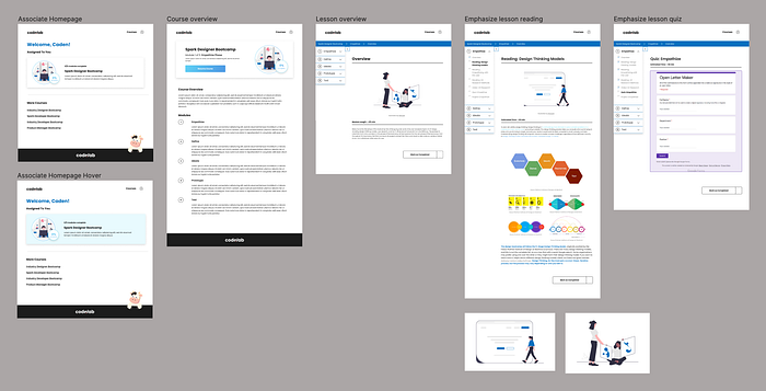
Associate — Course Page
PM — Team Page

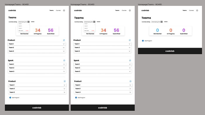
Board — Team Page

Board — Creating Course

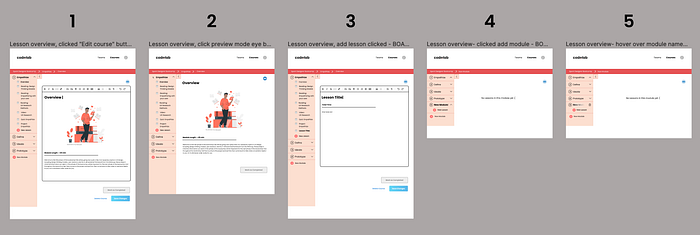
Board — Editing Course

Overlays

High-Fidelity User-testing
After completing an entire set of high-fidelity frames for the Training Tool platform, the designers conducted another round of user testing. This round of user testing was heavily focused on the User Interface. The user tests were conducted to get direct feedback on certain design decisions such as the placement of buttons, the size of buttons, and the overall uniformity of the frames. The feedback was quickly implemented into the final iteration of the product and officially handed off to the development team.
Development
Tech Stack
This project was developed with the MERN stack (MongoDB, Express, React, and Node).
- MongoDB: The project’s primary database
- Express: A back-end framework for storing and retrieving data from the database
- React: Used with Next.js to create a user interface
- Node: A JavaScript runtime environment that both React and Express use
Additional technologies
- Mantine: A React component library that allowed us to quickly create UI components
- Tiptap: A headless editor framework used for lesson creation/editing
Technical Terms in this Article
- Schema: In this article, schema refers to the JSON format with key-value pairs in which data is stored in the database
- CRUD: This stands for Create, Remove, Update, and Delete and refers to back-end routes for modifying data in the database
- Axios: A React library used for calling back-end routes
- React state (may be mentioned as state): Information stored in code that, once updated, re-renders the user interface
- React context (may be mentioned as context): Global React state that can be accessed across different files
Backend Schemas
- Cohort: Information about a CodeLab cohort
- Program: Information about CodeLab programs, such as Spark and Industry
- Team: Holds users contained in a project team and the name of the team
- User: Account information
- CourseProgress: The amount of progress a user has on a specific course
- ModuleProgress: The amount of progress a user has on a module of a course
- Course: Holds the course descriptions, modules and lessons
Authentication / Front-end
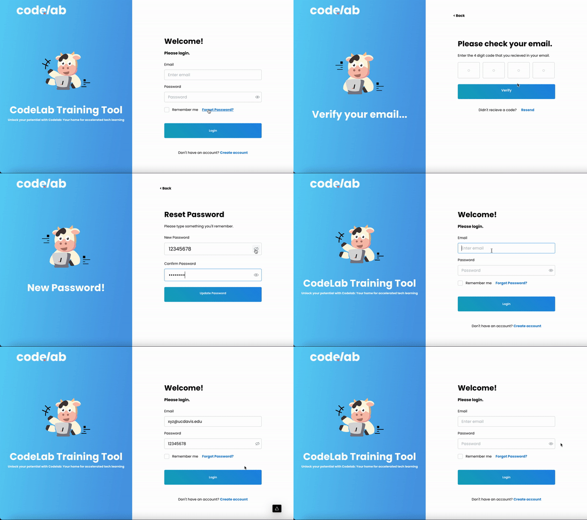
The above walkthrough displays the process that a user can go through to reset their password and to eventually login. If a user forgets their password, they can navigate to the “forgot-password” page to input their email there. Once they put in their email, a code will be sent to their email. Simultaneously, they will be redirected to the “enter-code” page, where they will enter the code they received in the email. We verify to make sure that what they enter matches the code sent to them. Once they enter the proper code, they will be redirected to the “reset-password” where they can enter in a new password, and to also confirm their new password. From here, the user gets redirected to the “password-changed” page, and can redirect themselves back to the login page to successfully sign back in again. We were able to route users from one page to the next by using next-routers. To create the forms and maintain uniformity among our pages, we used the Mantine library, which allowed us to detail, customize and reuse the different components on our pages.
As for creating an account, someone who is wanting to create an account must be first verified by the CodeLab board to do so. If their email doesn’t exist in the backend among potential users, then it is impossible for them to create an account. Asides from email, first name, last name and password are needed to create an account.
Authentication / Back-end
For our authentication on backend routes, we utilize cookies and JWT tokens. On all of the routes except the login route, the route will check if your browser cookie contains a JWT token contained the current user information. If the JWT token contains a current user, the route will work otherwise it will through an error. When you log out, the token is deleted.
Project Manager Page

The Project Manager (PM) page is designed for monitoring the progress of their team during the bootcamp and managing the courses their associates are taking. This page can only be accessed by the PMs. The associates on the team are split up based on their respective roles. PM’s have the authority to add and delete courses for an individual associate. Additionally, they have the power to select all the users within a role and assign courses to all the users at the same time. The progress of each course is displayed next to the course for each associate to enable the PMs to track how far along the bootcamp their team is. When you hover over a course, it will be highlighted, and a button will replace the progress component, giving the PM the option to delete the course if necessary.
The settings/logout component is also incorporated into this page. This popup shows which user is logged in, their role, and which team they are in. At the bottom of the dropdown is a button for the user to log out of the website.
Many of the components used in this project are from the Mantine component library and we made custom reusable components, like the “Assign course” button and “Assign course to all” button, to ensure that similar components with different actions would look consistent across the pages. Conditional rendering is used to display the users and roles depending on the different associates in the teams.
Cohort (Board) Page / Front-end

The above demo demonstrates the capabilities of the cohort page, which is only accessible by board members. This is where board members can view existing cohorts, programs, teams, users, and courses assigned to each user. Through this page, the board can also manage these cohorts, and can add, edit, or delete items as necessary. This demo specifically shows how to add a new cohort, program, team, and user, and how to delete them. When a member is added, the board only enters the email of the member, as well as their role, which is stored in the backend. Only the user’s email and role is displayed initially, though the board can still assign courses to this person. When the member creates their account, filling in their first and last name and any other necessary information, that change is made to their existing user object in the backend, which is then reflected on the cohort page as well.
The page makes use of React contexts, which allows for passing and managing of data (in this case, a list of cohorts that contains all relevant cohorts, as well as information about associated programs, teams, and users for each cohort) to be displayed on various components in the page. When the page is loaded initially, the data is pulled from the database and stored on the frontend through the React context. Changes are made using specialized reducer functions, which make API requests to the backend using Axios. This makes changes to the database using back-end CRUD routes and to the state maintained by React context. Making a change to React context re-rendering components as necessary to have the frontend reflect those changes as well.
The page makes use of reusable components, with some of these components being shared between the board and PM pages. It also makes use of the Mantine library, which provides a cleaner, more uniform look to the UI components. It also provides customizable components such as drop-downs and overlays.
Courses
The course portion of the application is divided into three separate parts: the user homepage, the course homepage, and the course page itself. Each of these three parts have three different views depending on the access level of the user: associate, project manager, or administrator.
Homepage

The homepage is the centralized location where associates can access the main course they are assigned as well as explore other courses they are interested in. In addition, it is also where admin’s are able to create new courses.
Course Homepage

Inside of the course homepage, associates are able to read about the course as well as an overview of all the modules and their corresponding descriptions.
Course Page

The course page is where associates can access the course material, navigate through modules and lessons. If the user is an admin, they are able to add, edit, and delete modules and lessons.
Takeaways & Challenges
There were several takeaways from building this website:
- Collaborating with developers and conducting user-testing taught us that Iteration is the key to crafting an exceptional user experience.
- Development as a whole is a constantly learning process.
- Having so many moving parts in such a large application showed us that communication is necessary to be successful.
Building this website was a very challenging and rewarding experience. For most of us, this was the largest application we have ever built. By the end, we had 850+ commits to the project GitHub and a Figma that modeled three fully developed user flows. Despite the ambitious nature of the project, we were able to complete a fully functional MVP that we are proud of. Working on CodeLab Training tool allowed us to build/expand our software development and design skills and create close friendships with people in our team.
